Well-Done
My Role
UX LeadInteraction DesignUsability TestingPrototypingUser Flows
Year
2023Project Type
PersonalCase StudyDeliverables
High Fidelity PrototypeUser ResearchDuration
4 weeksBrief
I wanted to create a food app that prioritises the needs of the end user. Tailoring around the user’s cooking skill level whilst easily navigable. One factor that the app addressed was time and its impact on home-cooked meals, the app needed to help those who could quickly cook themselves rather than relying on delivery or takeout. The UI needed to accommodate for this factor, whilst also providing advanced options for multiple types of meals with varying effort required.
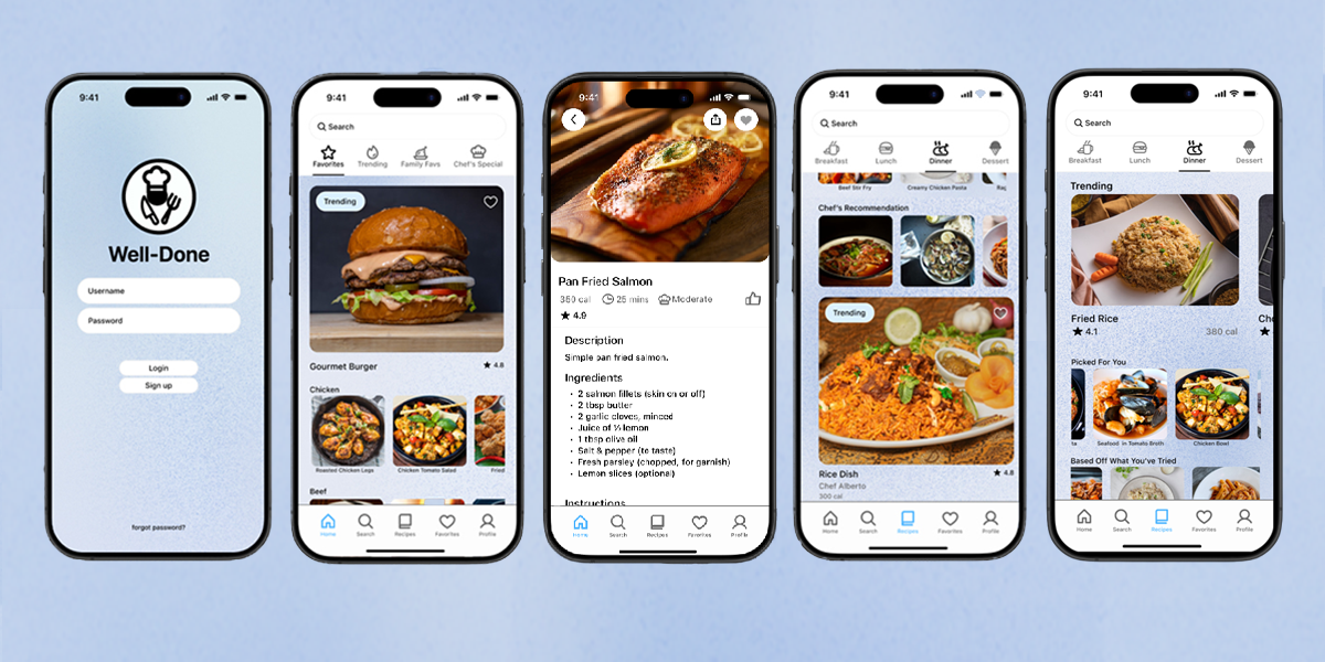
Dishes are split into categories depending on the main component that is used i.e. (chicken, beef) or type of dish i.e. (rice, pasta). The design itself is loosely based of the structure and navigation of a streaming app, offering a range of recipes whilst also allowing easy access of saved meals when your loose on time, or revisiting a favourite. These types of were the types of features I would personally like included in food apps.
Challenge
Create an accessible food app for all ages, streamlining the cooking process by making recipes easily accessible, and catering to individual skill of the user. Offering information and guidance with the help of professionals that make the learning process easily followable.
User Research
User research was conducted through one-on-one user interviews. Questions asked revolved around time allocation, factors affecting meal preparation and cooking, general experience with food apps, recipe books, videos and other forms of external factors that interests them to cook. The survey focuses on identifying the target users, challenges, and effort involved when creating meals.
How often do you cook yourself?
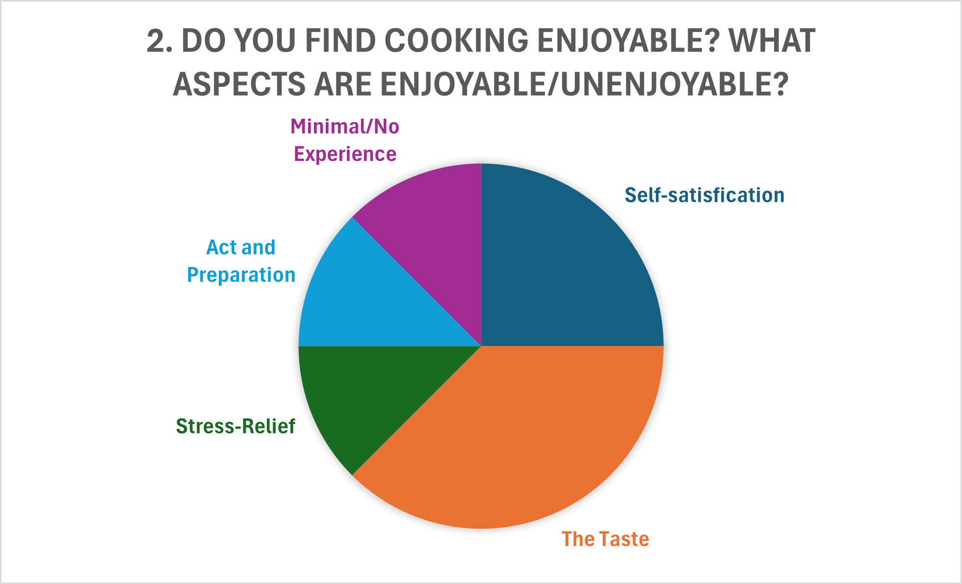
Do you find cooking enjoyable?
Are there any factors that disuade you from cooking?
Do you find yourself looking at recipes, videos, blog posts etc. on new recipe inspiration?
Are there factors that prevent you from cooking other than skill level?
What ways could cooking be presented to entice someone who has little to no experience with it?
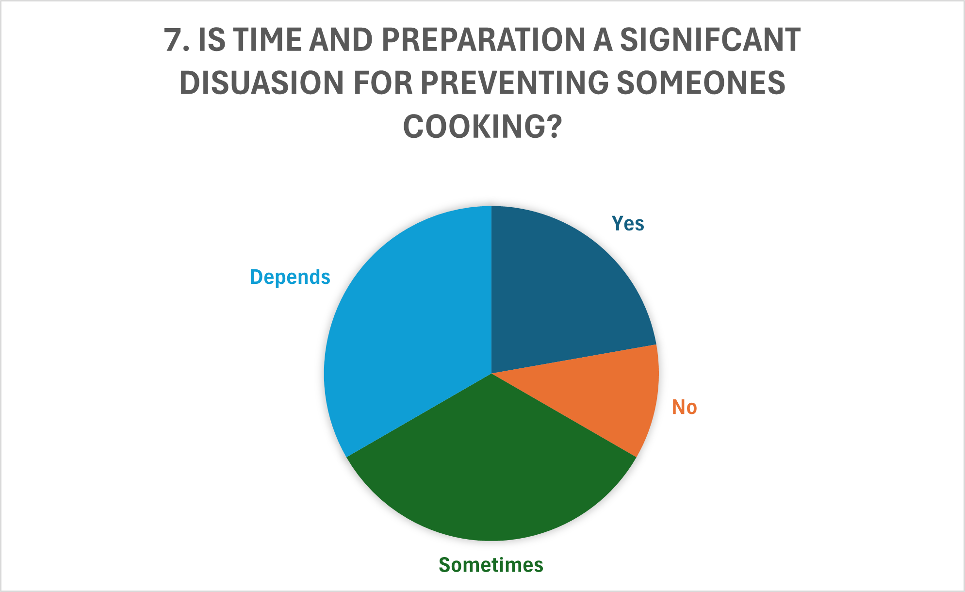
Is time and preparation a signifcant disuasion for preventing someones cooking?
What type of features would you suggest in an food app to encourage its use?
Results
User Insights
In total there were six participants were interviewed. A half of the people preferred to cook themselves where possible, with exerted effort greater than the price of constant takeout. Other factors such as parental figures affected this statistic and were not purely takeout/eat out. Factors that had dissuaded cooking were time, a majority experience and skill expressed by two whilst, and a lack of need to cook, either via food provided by others or a general lack of interest. Whilst time to prepare and cooking can prevent someone from cooking at home, other factors such as ease of ordering food, reliance on others were expressed to be a greater factor rather than time scarcity. Amongst participants involved, participants suggested features such as skill-based tailoring, advanced categorisation and library, and time-based suggestions that could accommodate for time constraints.
User Needs
To create a first prototype, we must identify the target audience’s needs and goals. Who is the target audience? Home cooks of all skill levels. Audience needs; personalised recipes, skill level and time-based recommendation systems, simple catered meals anyone can make without the need of special equipment. The goals? Reduce allocated time in the kitchen, free up time and resources, discover new recipes. The product will be developed into an app. Accessibility inside and outside the kitchen is important, increasing convenience, whilst considering the surroundings of the place the app is used, the kitchen. It needed to be portable, so that recipes could be easy to follow whilst freeing up space in what could be a cluttered or messy kitchen.
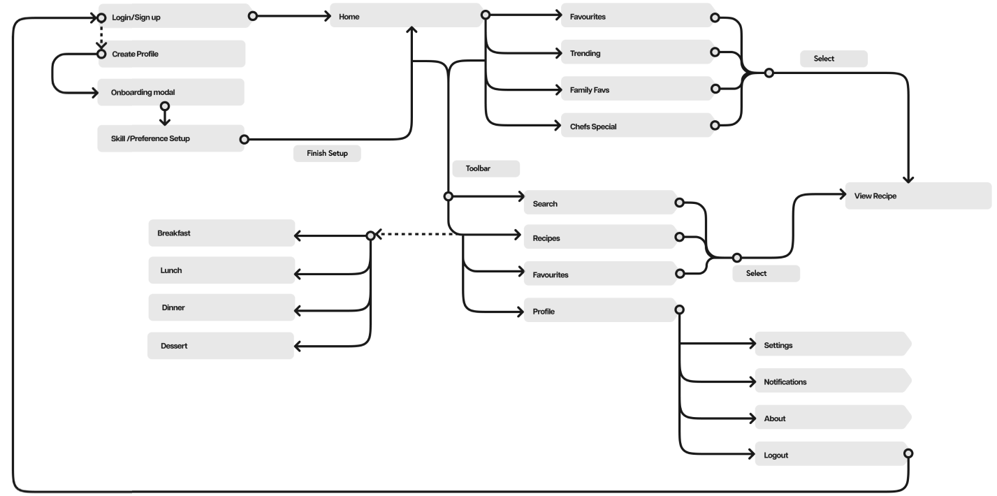
User Flow
Before sketching and wireframing, the user flow was created outlining the structure and app navigation. The outline showcasing the general flow of the app. The design is relatively simple, everything can be accessed via the the home, whilst toolbar works to gateways to other app sections. The pages will show a multiple of options, similar layout to a video streaming app.
Ideation stage
Low Fidelity Sketch Prototype
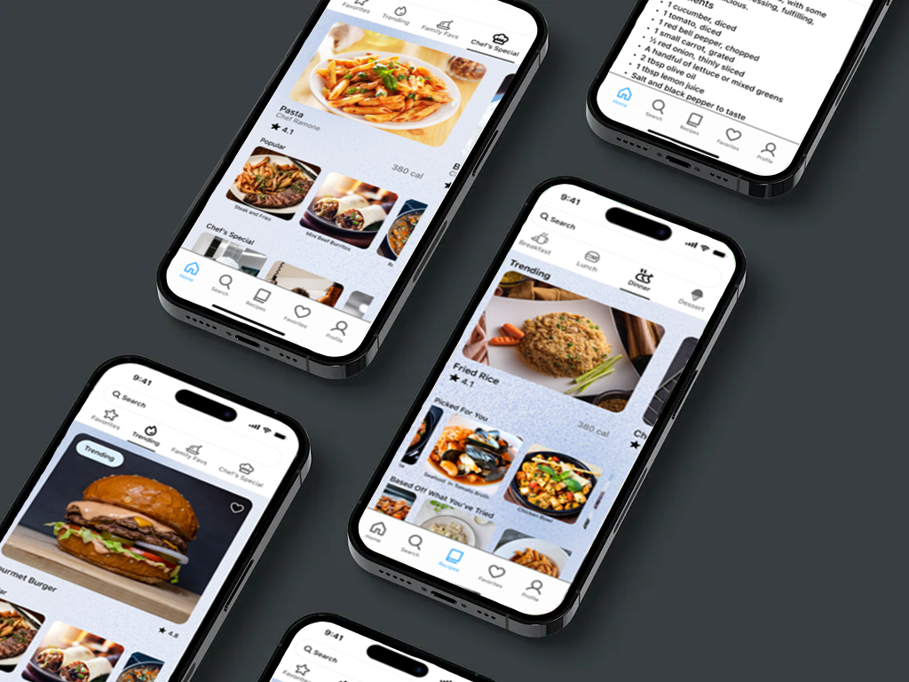
The development of the user flow adapted into app screens to see the flow and organisation of elements needed for the app. The app has a stacked layout, presenting many different options to the user, without taking too much screen real estate. The app is split in a grid-like layout where rows are scrollable. This provides the user many options whilst reducing the individual menus and screens, whilst reducing the amount of vertical scrolling.
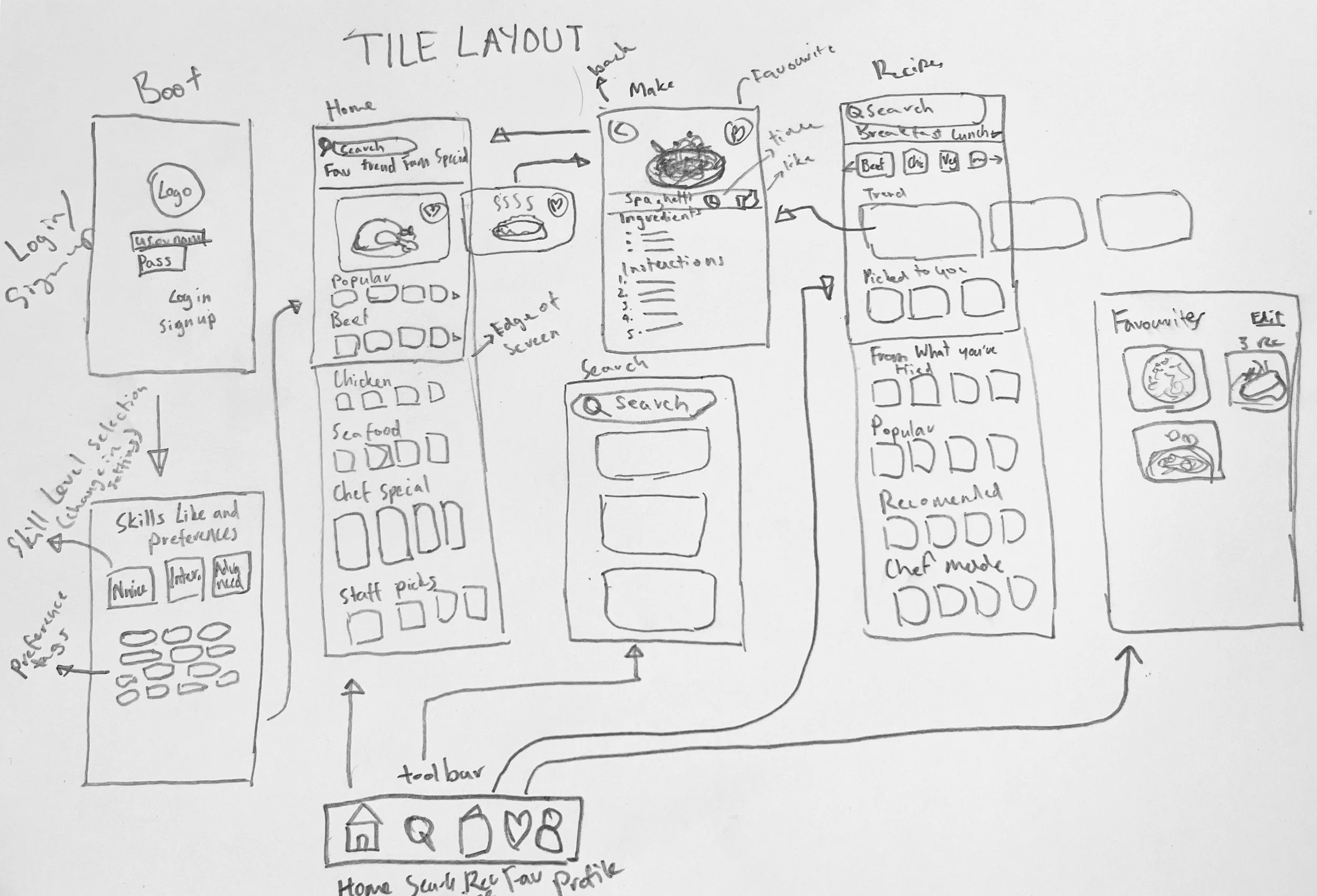
Low Fidelity Initial Sketch And Wireframe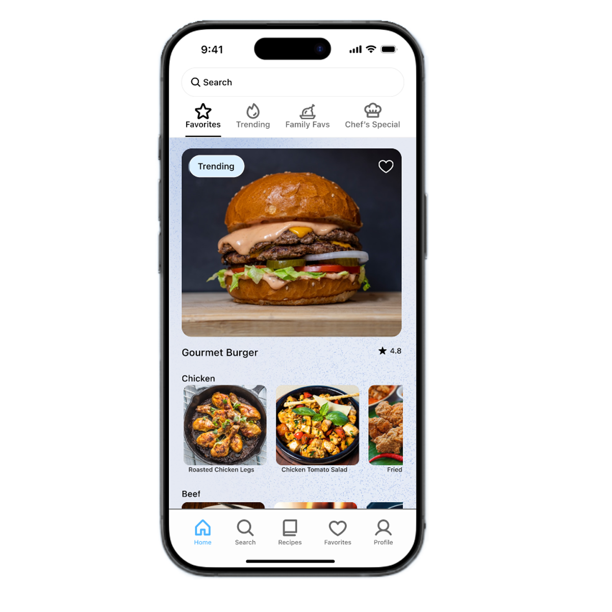
Favourite
Users are able to mark and save recipes that they favourite. Works as a library for users to easily access their go-to’s. Reducing actions of the user frees up capacity to recall whilst reducing the decision making needed, freeing up time spent outside the kitchen when deciding what to cook.
Categorised Meal Types
The recipes tab sorts foods by the time of day they are most likely consumed; Breakfast, Lunch and Dinner. Sorting by situated meal times breaks can help the user decide based on what’s recommended for meals most likely suited for the time of day. Structure and navigation of these tabs are not restrictive, users will be able to access and decide what’s best for them rather these tabs act as soft suggestions that may help the user decide what to make.
User Testing
One-on-one usability tests were conducted observing user behaviour, interaction and response towards the prototype. Participants' reception noted both positive and negative reactions, whilst providing valuable feedback. Participants were asked to complete tasks whilst navigation time and verbal response were observed and recorded.
Some users expressed that structure and navigation could use improvement. One suggestion was the addition of a navigation bar or menu underneath of navigation bar, displaying different categories including different meats, vegetables, and bases ie. rice or noodles.The tester suggested a revamp of the app structure, adopting a larger grid based structure, enlarging items whilst, including greater detail of the item itself underneath the item itself.
A separate user interviewed suggested removing the search bar at the top of each screen or simply converting it into a small icon, freeing up screen real estate which could then be replaced with filtering tags or options. Prioritising minimalism would modernise the design whilst also minimising distractions contributing to a neater UI.
Recomendations
Grid Layout
Second or Sub Navigation
UI Simplification
Categorised Food menu
Conclusion
Throughout this study, the user research and feedback many improvements can be made. Including a rework of the user interface, whilst all fundamentals are present, ability to push the product into something more unique was expressed.